While some have used this particular measure of breadth as “confirmation” of the uptrend in stocks, I’ve been pointing to another measure which has been diverging dramatically in the second half of the year. This is of course the Percentage of stocks trading above their 200 day moving average (or “in uptrends”) making lower highs with each new high in the market. But that’s not what today is about. You can go here if you want to read more about that one. Today is about that other measure of market breadth, the Advance/Decline line, specifically the NYSE Advance/Decline line.
Here’s a chart of what it looks like:
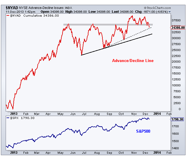 We can start by pointing to the fact that the new all-time highs we’ve been seeing since last month have not been confirmed by breadth. You can see that better in this chart: (more)
Please share this article
No comments:
Post a Comment