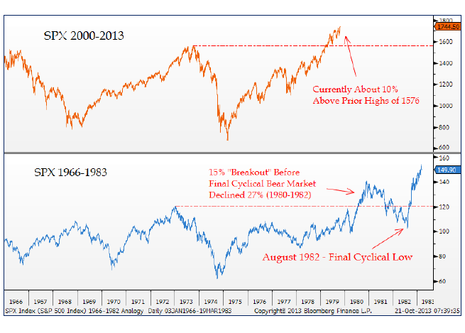
The first one is the current decade breakout in
$SPX compared to the one in 1980. As excited as many people get about this breakout, notice how one more pullback was needed before the eventual 1982 low in the market:

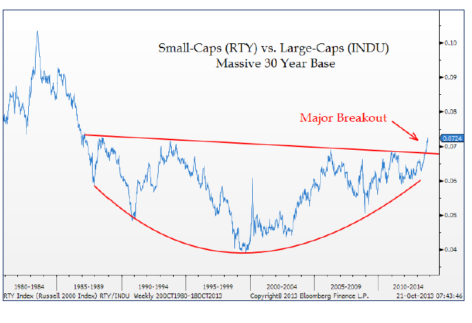
The next one shows the Small-cap Russell2000 vs the Dow Jones Industrial Average breaking out of a monster base. Isn’t this beautiful?

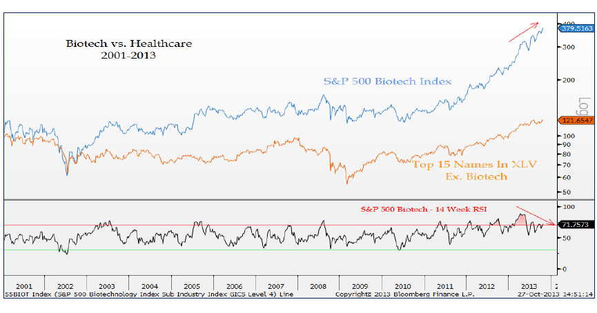
We’ve all heard about how great healthcare has done this year, and more specifically biotechnology. Jonathan took this a step further and plotted the Top 15 names in the S&P Healthcare Index minus the biotech names. Look at the difference in the two charts. I think there’s a mean reversion play here:
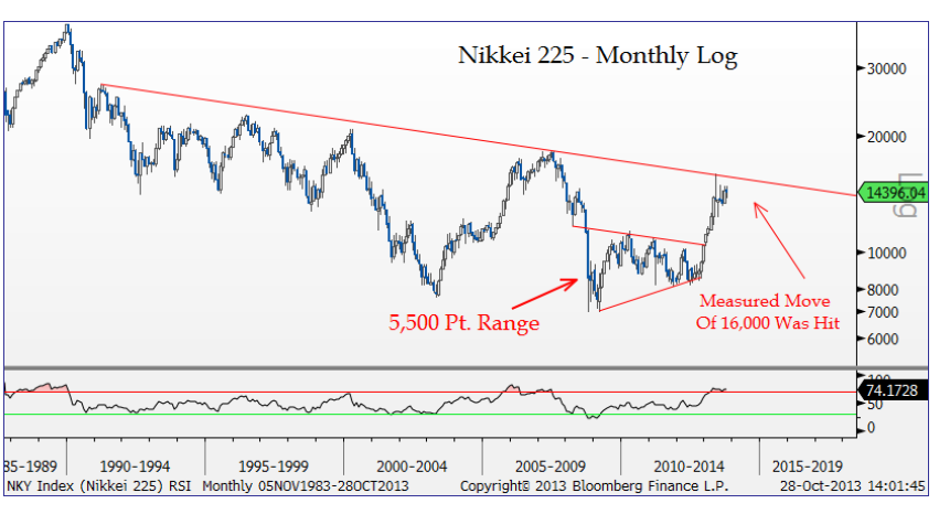
Everyone I speak to these days is bullish Japanese stocks. Do you know anyone who isn’t? It’s almost an insult to someone if I come up with a counter-argument. Well, here is a chart of the Nikkei running into a mufti-decade downtrend line, as well as the exact measured move from the 5500 point consolidation before last year’s monster breakout:
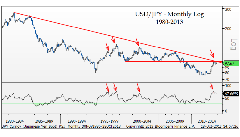
And while we’re on the Japan topic, here is the highly correlated Dollar/Yen cross. And like the Nikkei, we’re looking at a mufti-decade downtrend line as well as horizontal resistance:
Please share this article
No comments:
Post a Comment